
Branding and re-branding to stay connected to your audience
The examples of great brands that have renewed their image in recent years are many. Let’s find out together why they did it
In recent years we have witnessed numerous branding and re-branding actions that have involved above all famous brands. We live in a period of significant transformations, political, economic, social and this is also reflected in the management and design of the brands – because the brands are part of us, are part of our panorama of social interactions.
Often, there are external or internal factors that require companies to rebrand. Both elements can be due and/or desired.
In a nutshell, the decision to operate a re-branding belongs to policies of:
- merging (acquisitions, mergers, joint ventures and alliances) aimed at optimising the relationship with the supplier system and improving the offer with lower average product costs;
- downsizing, aimed at making the internal structure of the company more and more streamlined and responsible, emphasising at the same time the value of the company culture, efficiency and organisation;
- enhancement of the intangible characteristics of the offer, designed to build customer loyalty and focus on brand equity.
Some recent re-branding cases
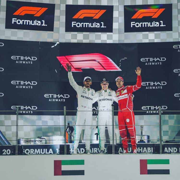
The new image of Formula 1 (there was the first race of the world championship, in Australia, recently) is a change of direction. The new layout turns out to be particularly fancy, less institutional and more inclined to be digested by the video gamers (very reminiscent of Wipeout).
Not that the “old” F1 logo – drawn about 30 years ago by Carter Wong – did not work anymore; indeed, I personally find it even more effective and immediate than the new one, but the need – probably – was to establish a before and after. A change. An evolution?
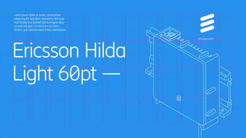
Ericsson (former Swedish mobile giant) has done something different: from a brand point of view he adjusted the monogram “E” (a very technical thing that very few would notice) by entrusting the design to the Stockholm Design Lab studio: a nerd operation that involved the inclination of the three diagonal sections, making them more suitable for screen reading.
The “true” work (the visible, tangible one) then focused on the system identity: new font (Ericsson Hilda – not among the best recently designed: little harmonious and too rigid the connections between vertical rods and round parts), new colour palette, new icons, new website. In other words, a new language and a new positioning starting from a relatively old, dated brand image; but maybe it needed a little more courage?
Vodafone preceded Ericsson for about a year. In October 2017, in fact, it launched a substantial repositioning campaign with a new and contemporary brand (redesign). The trend is definitely to streamline; to add value by removing.
New font and more prominent use of red – the institutional colour since ever and identifying note (at least in the telecommunication industry) of the brand: T-Mobile is magenta, Orange is orange, Movistar is green (rebranded by Lambie-Narn in March / April 2017), TIM is blue.

About TIM (very popular Italian brand), the launch of the new brand (designed by Interband) is dated January 2016. Although the new brand has seen a very controversial, much discussed and criticised start, it has not affected the values of the brand and its leading position in the industry.
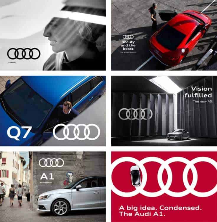
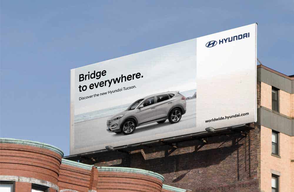
The automotive sector is probably the most responsive to trends. Frequent re-branding, revitalisation. The last two in order of time are Audi and Hyundai (2017).
Same operation for both: they have removed the 3D from the brand and moved to a new font, as an extension of the brand identity.
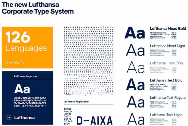
Lufthansa has done more or less the same operation of Ericsson. Even here few will notice the change, because – again regarding the brand – it is very technical stuff. Slight change of colour, the institutional blue becomes a bit darker, spruced up the lettering and the icon (which I thought was a heron. Instead I discovered to be a crane bird).
Another thing is the work done on the system identity (a project of Martin et Karczinski, in collaboration with the Lufthansa internal design team): considerable change in the management and application of secondary codes. More yellow, new font (a sort of slightly softer and more modern Helvetica, designed by HvD), new interiors, new fabrics, new uniforms, new livery etc.
![]()
Remaining in the industry, also Qantas – Australian carrier – in 2016 has revitalised its brand, with a significant change of lettering and a slight redesign to the kangaroo in addition to the introduction of a new well-designed monospace font.
Occasionally, something moves in Italy too: Meridiana becomes AirItaly and is proposed as a new flag carrier. And it does so by fully assuming the national colours of Qatar (Qatar Airways holds 49% of the property) and therefore with an entirely new identity but wholly disconnected from Meridiana itself.
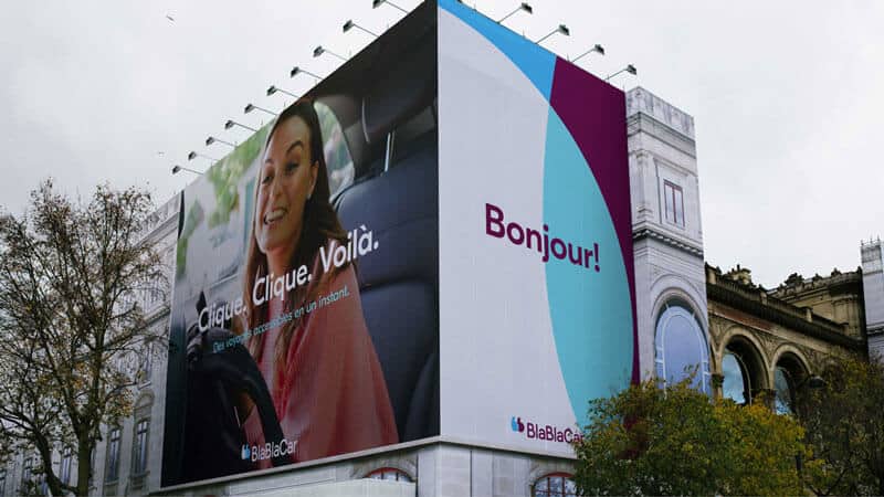
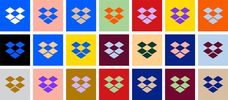
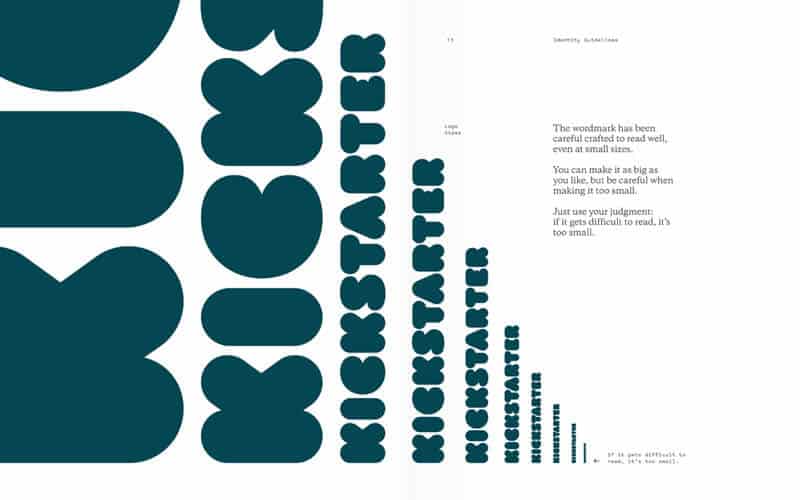
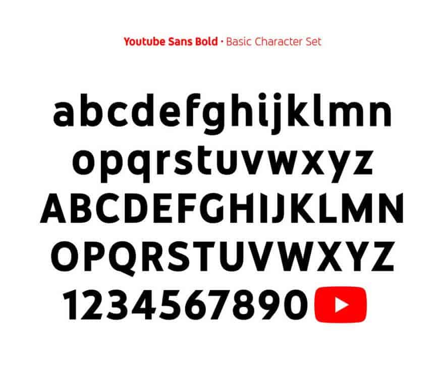
The brands subject to constant changes are those most closely related to digital. Youtube, Dropbox, Deliveroo, BlaBlaCar and Kickstarter, for example, have massively rethought their brand in recent months. New logos – often completely different from previous ones, new fonts, new colours and new icons.

To demonstrate that everything is brand-able and that the trend is towards simplification, recently the UK parliament has also remade the institutional look with a new logo, a new font (from serif to sticks) and new colours. Furthermore, they have also changed their brand-name: from House of Parliament to UK Parliament (Brexit question? Nationalisms?).
![]()
![]()
Why make re-branding
Contemporaneity always makes the difference in re-branding decisions, but the problem is not so much a change of colour or a graphic sign.
With the right investment, you can brand anything, or you can adequate anything you want and make it part of your brand.
The problem is how to build strong brands, able to be appreciated by the market and to last over time, reinforcing and adapting to its changes. It is a slow, delicate process that requires targeted investments, specialised skills and an overall and forward-looking vision of managing relationships with the market (people, stakeholders).
Generally, beyond the differences proposed by the various theoretical models, the phases of development of a brand are: the birth, expansion, consolidation of leadership and repositioning.
In general, achieving high brand recognition should not lead to the presumption that the work of brand management is over.
The brand, due to the environmental and competitive changes in the market, is subject to a progressive erosion of its potential. It is, therefore, necessary a continuous process of innovation of the brand and of all the resources that sustain it, to avoid that this, once obtained the leadership, loses it because no longer able to guarantee a sufficient competitive advantage (creation of value) for the customer.
External factors that affect Re-branding
In its activity, the company generates value in different circumstances: dealing with the external environment (relational value), accumulating capacities and skills of its own (potential value) capable of translating into product or process innovations in business negotiation and in creating a competitive advantage for the client (transferred value).
More in detail, the relational value comes from the continuous comparison between the company and the external environment (customers, institutions, suppliers, partners). In this context, born from the different needs of the business, you can manifest exciting innovations that can take the form of useful changes aimed at reinforcing the competitive capabilities of the company.
It is good then that the company systematically plans its relationships, identifying first of all the potential interlocutors who can actively contribute to the process of value creation.
Internal factors that affect Re-branding
Apart from how the company interacts with external interlocutors, it is useful to underline that, for its very existence, the company must already possess an internal potential for creating value.
The potential value of a company includes its heritage, only partially-tangible, the knowledge involved in the production process, the organisational and entrepreneurial skills and all the internal resources that allow the company to stand out from the competition and to propose an innovative offer.
From the moment when the company places a product/service on the market, the value that the company incorporates into is transferred to the customer both in a physical sense, through distribution, and with communication activities.
From this moment on, the value creation process goes partly out of the company’s responsibilities and is personally managed by the customer. It is up to him or her to decide whether to take into consideration the product/service offered, whether to accept the image and the additional services and, above all, whether to judge the price defined by the company as adequate.
All that remains to the company is to listen. It only remains to consider the opinions and behaviours of customers and evaluate the value generated by the offer regarding market performance, relational and reputation performance, effects created on culture and identity of the company itself.
Using Branding to differentiate from the competition
The brand is one of the most delicate and strategic assets that a company has to face the competition. And it allows to:
- identify the various products on the market and their origin, allowing the customer to assign responsibilities to a specific manufacturing company;
- orient the buyer in his purchase process: a well-known and credible brand is definitely decisive in the industrial goods market because often the buying companies, after having analysed several possible purchasing solutions, tend, for the same performance, to acquire known goods and therefore able to better guarantee the satisfaction of their needs;
- create customer confidence and thus reduce the risk component deriving from the purchase of an asset.
Furthermore, correct brand management provides the company with the opportunity to position itself in relation to its competitors; informs the market about the distinctive qualities of the product; simplifies the relationship with suppliers and customers; facilitate customer loyalty more naturally and efficiently; promotes the differentiation of the offer.
Perhaps it is not surprising that there is a strong correlation between the time since the last revitalisation and the success of the brand.
In fact, revitalising a brand every three to five years get higher positions in the brand success index. This trend in its entirety indicates that brand renewals are essential.
What are the advantages of keeping a brand always updated?
The visually and thematically relevant brands have more chances to establish a connection with the audience, and a well-managed brand indicates a well-managed business.
The brands under stress, which must face the emergence of strong competition and price pressure, are brought to have more benefits if revitalised, gain an immediate competitive advantage.
The perception that is generated upon brand revitalisation is a value that is added to the strength of the brand and which triggers secondary effects of acquisition – almost involuntary – of small percentages of new market shares.
If your brand is more than five or six years, make an appointment with a branding agency. You need it.