
As we proceed through this article, you’re going to notice something of a theme involving group software tools, but it isn’t that surprising. Because SaaS companies tend to run through monthly charges, they don’t benefit as much from making individual sales, and they need to keep their customers loyal to make money. That’s the kind of demand that sparks experimentation.
Basecamp is a project management tool that makes it easier for a team to stay on track with collaborative projects, and the homepage illustration (see below) perfectly encapsulates the problem that the software was designed to solve.
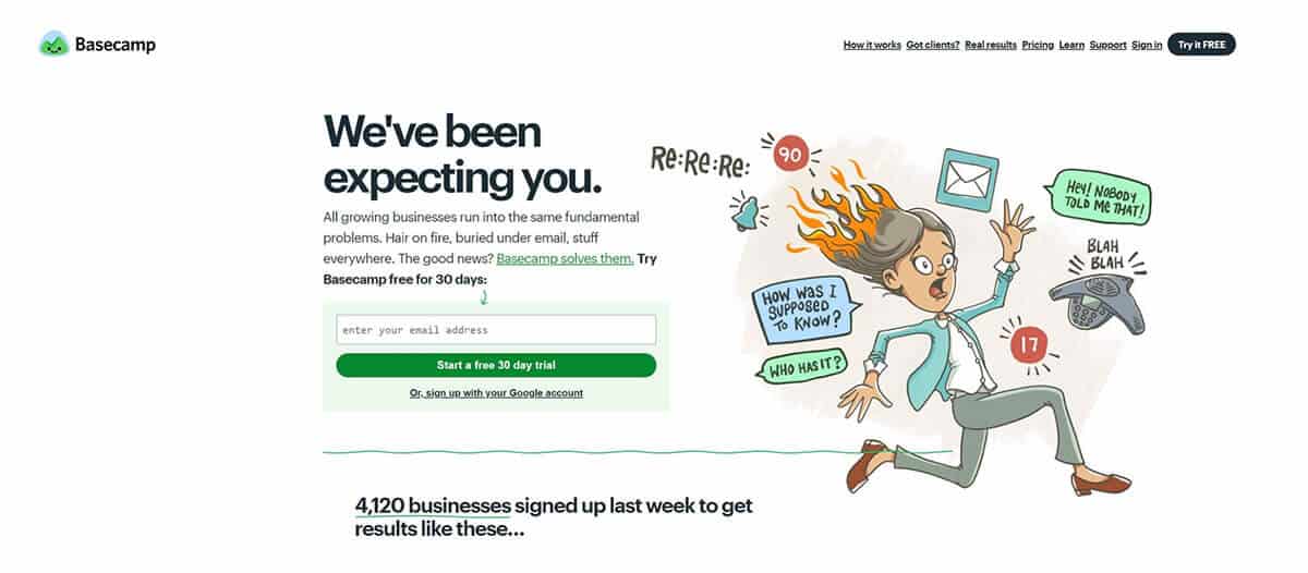
With an alarm going off, a conference phone ringing, emails appearing, and a scalp-scorching roast taking place somehow, it’s quite clear that the lady in the image could use some assistance.
A common problem with this kind of “big picture” software package is communicating the benefits to managerial types — problem solved.
Everyone is familiar with Airbnb by now. Within a relatively short period of time, it took an industry controlled (for the most part) by large hotel chains and greatly expanded the options. Today, you can easily rent (or rent out) a room, an apartment, or even a house, and it almost doesn’t matter where you go in the world since the user base is so vast and varied.
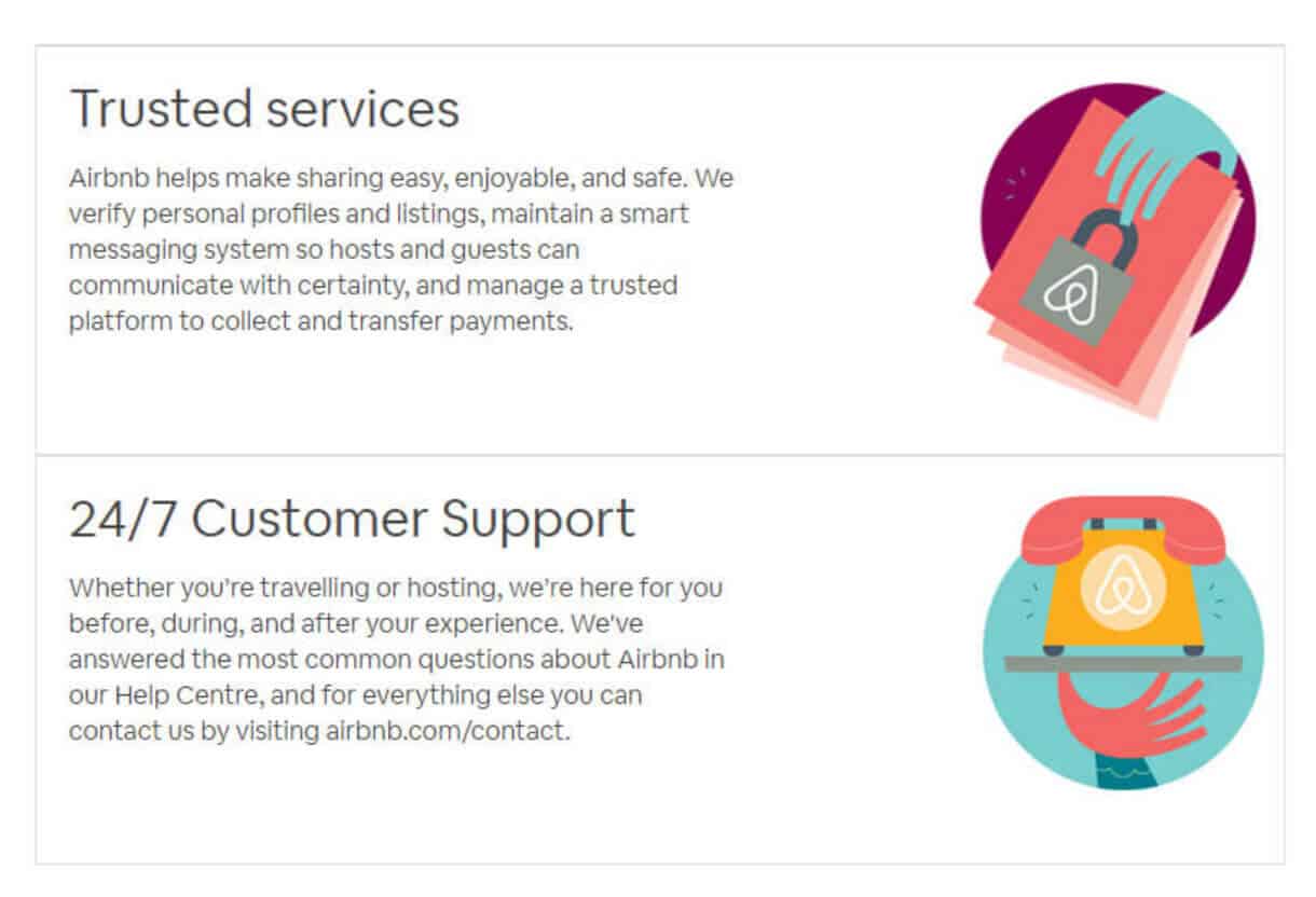
While it doesn’t lean on illustrations for its homepage (not shocking, since it needs to be resolutely functional above all else), it does bring in illustrations for its trust indicators, which makes sense. The objective of the page is to get across the idea that the people of Airbnb can be trusted, and adding some homespun charm in the form of illustrations is a good way to do it.
I told you we’d be covering various software suites! Next up in the list is Intercom, a customer messaging platform built to support sales funnels and make it easier for brands to communicate usefully with their current (and prospective) customers.
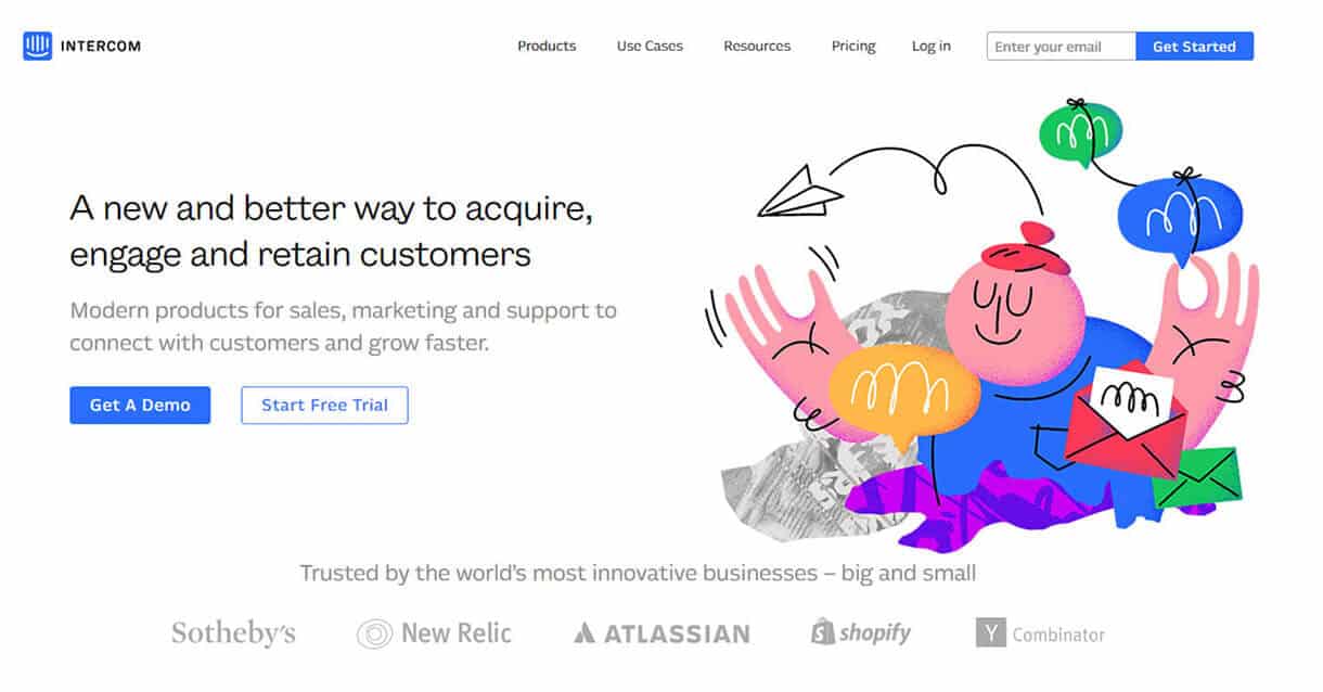
I greatly enjoy the style of the illustrations they use. Very simply, unrealistic, and playful. Note the motion indicators and the rampant use of wavy lines. The entire aesthetic advances a feeling of joy and childish wonder reminiscent of book illustrations (somewhat fitting in the context of encouraging conversation, then).
BuzzSumo is a platform for content marketers, helping them to identify the best-performing content across different platforms and find the most influential social media users within particular niches. But it isn’t in the main product designs that the illustrations appear — it’s in the featured blog images:
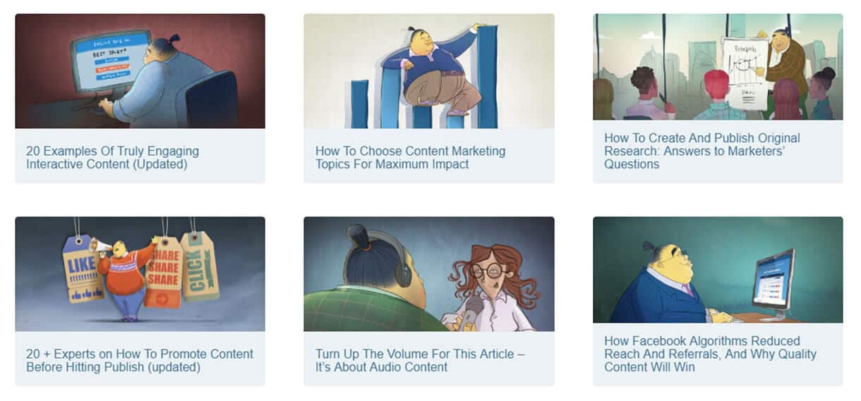
This is a nice flourish for the brand, because most blogs heavily feature stock imagery. Stock images don’t look bad, for the most part, but they’re entirely generic. That’s why it’s so different and impressive for the BuzzSumo content team to produce (or have produced) a fresh illustration for each post — it makes it clear that every single post is viewed as valuable, subtly communicating to the reader that they shouldn’t skip any one of them.
Taking a break from the marketing world, Oscar is a healthcare insurance platform with a difference — that difference being a focus on giving as much power and choice to the consumer as can be achieved.
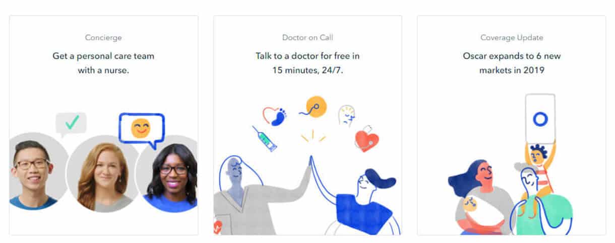
Children’s hospitals are often decorated brightly and cheerfully because it’s important for people to stay optimistic about their health, and there’s something similar going on here. Any company with adorable illustrations must have good intentions, we reason, and would never try to exploit people for profit. Is that accurate? I don’t know, I haven’t used Oscar, but that’s the power of these illustrations.
In this ever-complicating world, mental health is an escalating concern. We’re all so stressed out over economic woes and environmental dangers and countless other fears that we find it hard to relax, and the always-on digital barrage doesn’t help. Who can focus around the irksome non-stop chirping of the Twitter world?
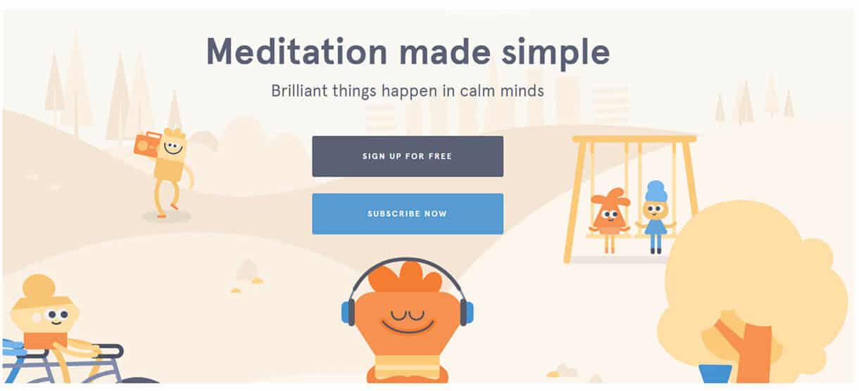
Headspace is a comprehensive meditation guide in the form of a service. You just need to sign up for free and start taking advantage of the meditation exercises and recommendations to free your mind and (I assume) harness your chi to some extent. And since modern life is loud, irritating and quite threatening, why wouldn’t you want to escape to a simple, pleasant, hazy cartoon forest?
InVision is a wireframing tool for designers and non-designers alike, making it easy to collaborate, share designs with clients, and get templates built with minimal effort. If you need to prototype a website or an app across diverse views, it’s very powerful.
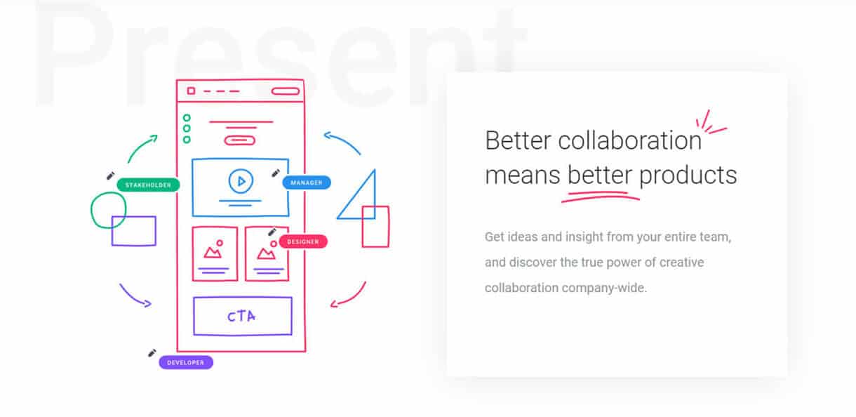
And within the context of the software, illustrations make total sense, because it allows freehand designs and notes on existing designs. The illustration above not only demonstrates some fun but also shows off real-world examples of InVision in use. Clever!
Building on the concept of a design language, Lingo functions much like a set of brand guidelines given steroids and plunged into a vat of mysterious chemicals. Any stylistic elements common to your brand can be stored inside it, leaving users to simply draw from it whenever they need to produce brand-accurate materials.
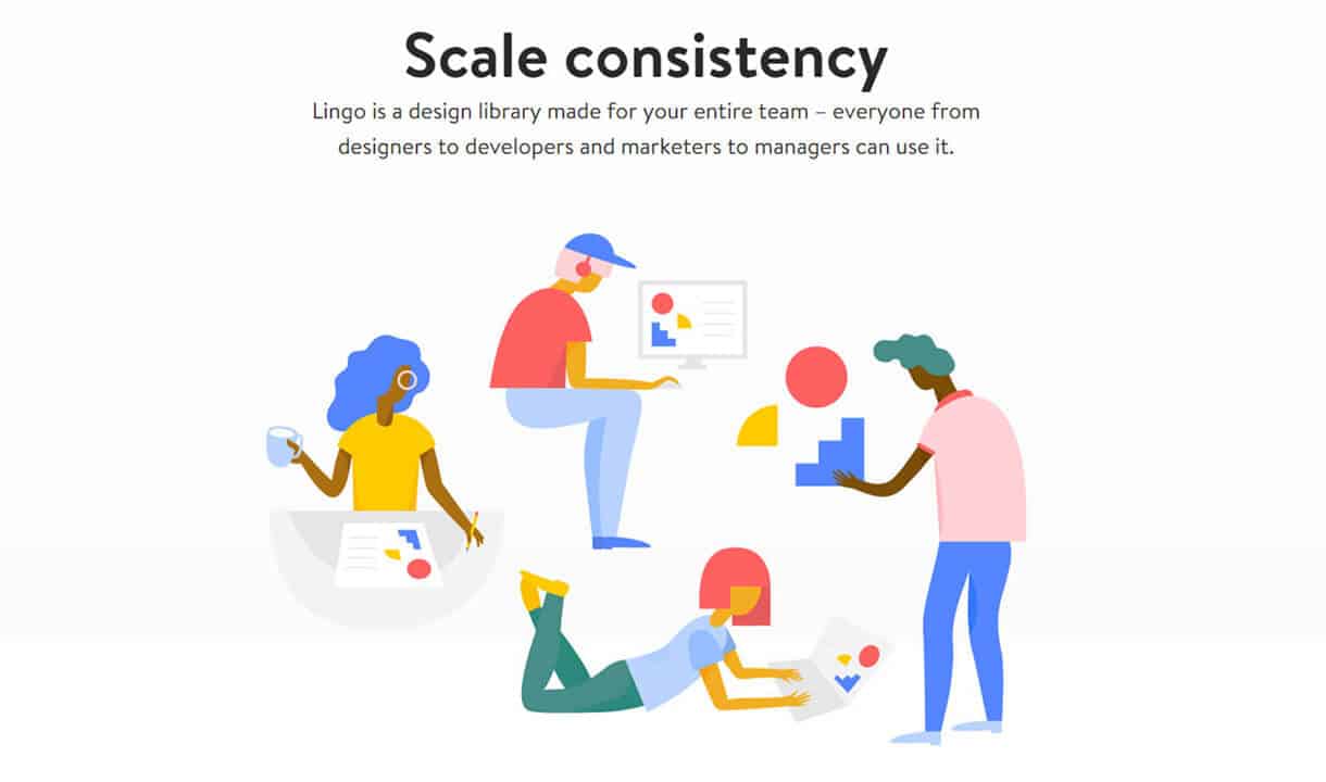
The bold and simplistic nature of the illustrations really encapsulates the implied ease of use. Not only are the shapes being played with clearly drawn from a Lingo library, but the people are themselves formed of very basic shapes, alluding to both the simple and the relatively-complex uses of the app.
Shopify is perhaps the leading e-commerce CMS for entrepreneurs and small-to-medium businesses. It makes it quick and easy for people to set up their own stores, customise them to their liking, and start making sales as soon as possible.
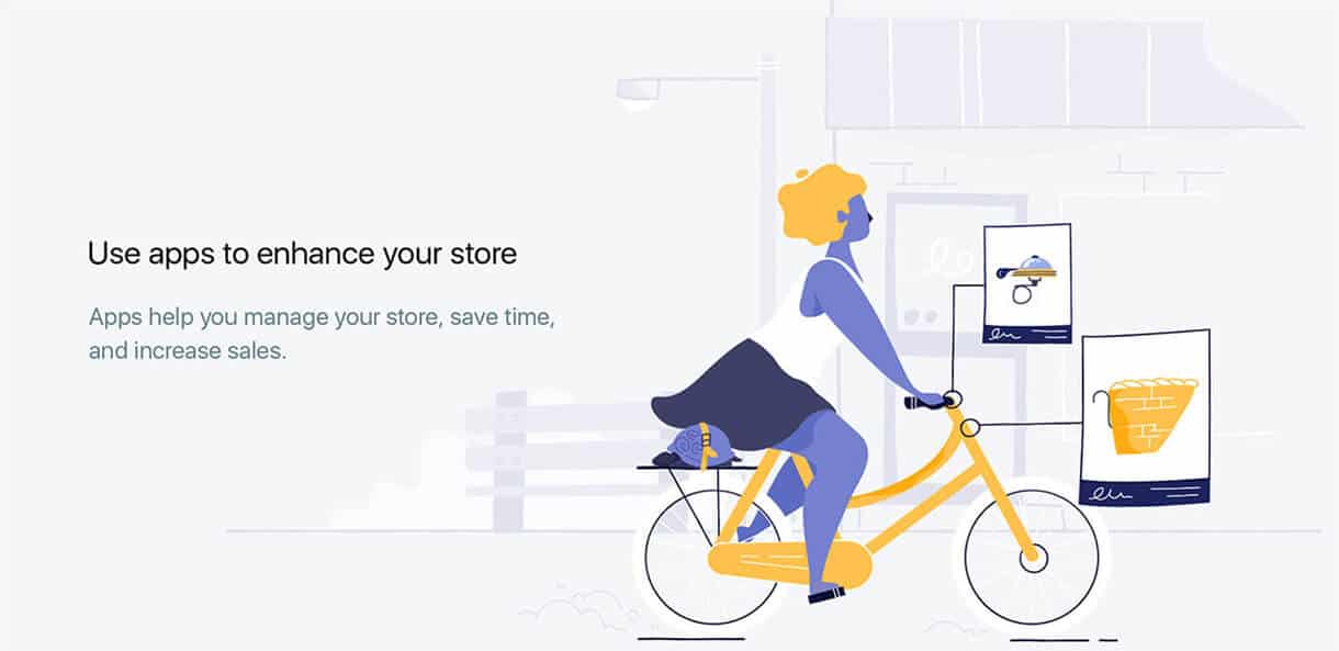
For each creative panel in the developer dashboard, there’s an empty state illustration preceding the creation of something new. It’s a creative freedom that has made Shopify the CMS underpinning most legit businesses for sale in Australia (online, at least), and the great illustrations help to encourage people to try new things.
You can see one of them above — we’re told of apps enhancing stores, and showing the accessories being added to a bike.
If you’ve worked in an office recently, you’ve heard of Slack. It’s a real-time communication tool for team discussions, allowing the establishment of multiple channels (typically one for each project or client) and helping companies to keep their exchanges light while still having long-term message records.
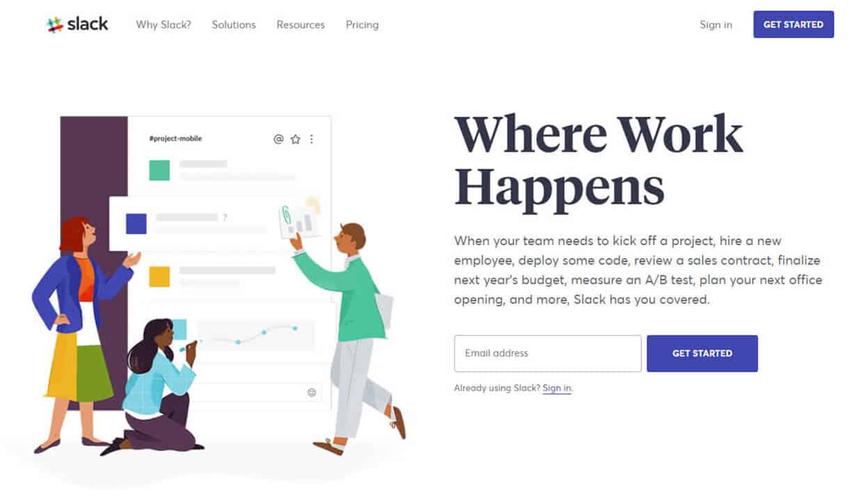
The entire software platform is infused with character and animation, so the illustrations were almost mandatory, but they’re also really good. By playing with scale, the Slack team shows people using the software without compromising its visibility, and while establishing it as a trusty background service that makes a perfect foundation.
Yes, there’s one last project management tool to look at, in the form of Notion. More sparse and utilitarian than something like Basecamp, it’s a solution better suited to tech-focused users. And hey — it even has a different stylistic approach!
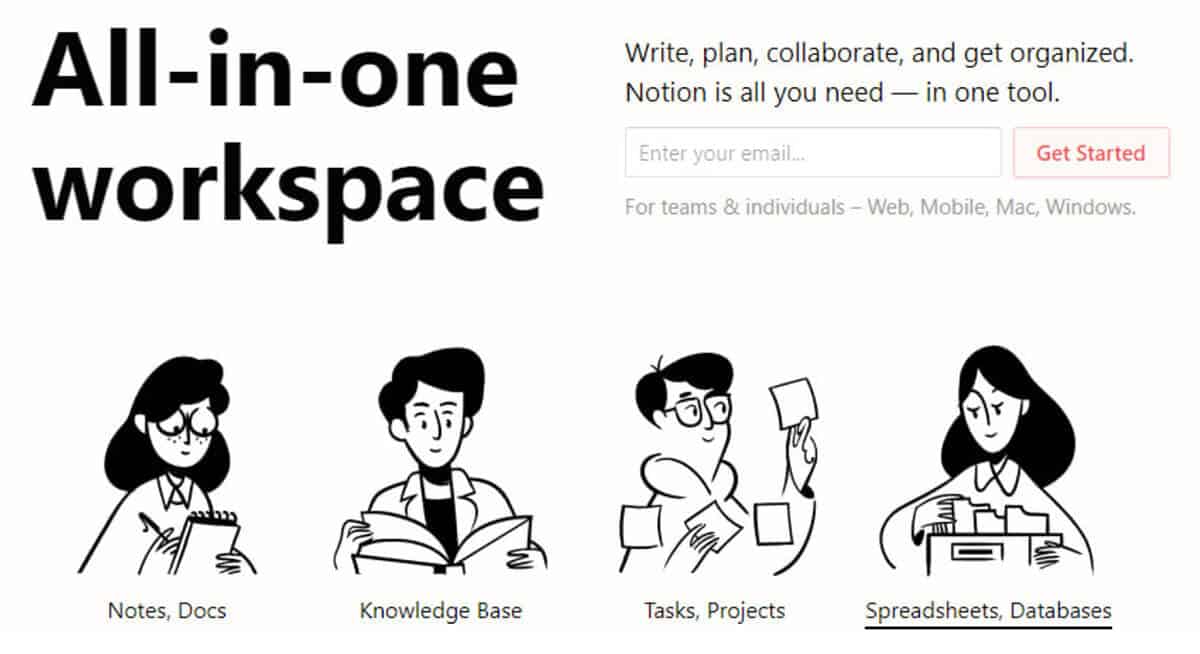
Instead of being decked out in pastel colours, Notion’s graphics are bold and monochromatic, and the designs are rather more retro than anything we’ve looked at thus far. Instead of aping comparable SaaS offerings, the Notion team decided to go in a fresh direction.
That departure is very commendable. There you have it — 11 brands sprinkling illustrations on their regular designs to give them some extra flavour. If there’s one takeaway from this piece, it’s this: if you ever need design inspiration, check out some SaaS companies. They know their stuff!