Pat Racco
Founder of Advantage Media

Fashion eCommerce Marketing
a quick introduction
With all the tools available out there, fashion eCommerce marketing has never been easier for anyone looking to launch an online store. Whether it’s a low-pain drop shipping business or a sophisticated Shopify Plus multistore, all you need is within reach.
That being said, when things are really easy for a sufficient amount of individuals, they quickly become really hard. Because the entry barrier is almost inexistent, the competition mushrooms and the market gets oversaturated in a blink of an eye.
Competition is tough and acknowledged. No matter if you spend a million dollar building your brand. You soon and unequivocally will be fighting against a 15-year-old girl selling crap from dad’s garage.
Your clothes may be better in quality but she may be great on Instagram or Youtube and you just can’t cope with it.
With my business, I deal with this exact same issue every day as I work with fashion brands, helping them find the right way to market their fashion eCommerces.
Some of them argue: “Well, it’s true, I compete with the world, but I have resources to invest. They won’t last long.” I don’t agree. Most youngsters will fail and disappear, for sure. But an army of them will pop up, and some will be a threat. All these little flies appear under COST in your cash flow statement, because your brand must standout to survive and thrive.
But how do you do that? By being different. It’s not just about the product anymore, but the experience you can provide.
This post was written by Kayleigh Alexandra from microstartups.org and I’d like to thank her for providing this to Advantage Media.
I personally know first hand how hard it is to create compelling content, so once again thank you, Kayleigh.
Fashion Marketing for eCommerce: How To Make Your Shopping Experience Stand Out
The fashion industry has always been deeply experiential, particularly when it comes to retail. There are practical concerns, certainly — finding the right sizes, getting the right clasp varieties, etc. — but people are largely driven by their senses and feelings. How do the items of clothing look? What emotions do they evoke? How might they affect your confidence?
This has traditionally made it a significant challenge to adapt the fashion buying process for the ecommerce marketing world. Many of the classic tricks just don’t work in the absence of a physical store. And the basic online shopping process tends to feel quite cold and abstract — hardly ideal for convincing people to part with significant sums of money for designer items.
These days, though, the march of technology plus rising design standards are making it possible for online-only merchants to provide excellent fashion-buying experiences. With leading brands pulling out all the stops to max out their sales, anyone who wants to make a tidy profit selling fashion products online needs to do the same or be left in their dust.
If you’re running a fashion-centric e-commerce store, then, it’s time to find a competitive edge. Here are some tips for making your shopping experience stand out:
Adopt a unique content style
Top fashion brands invest heavily in their content marketing and advertising campaigns, knowing how significantly a subtle tone tweak can affect the potency of promotional copy. One core advantage of the ecommerce approach is that you can easily get people to read your copy, so don’t waste that opportunity.
Ideally, you should infuse your content with a personality that neatly reflects the core model of your business. What makes your fashion items worth buying? If they’re designed to make people feel happy, convey that through your copy, getting across a joyful spirit. If they’re intended to make people feel powerful, then move in that direction instead.
You should also think carefully about how you format your content because brand identity extends to almost everything you do. Everything from the alignment of your text to the colour schemes you use should be consistent throughout your website and your marketing materials, all to make your brand feel more distinct (thus making it more memorable). Differentiation is a core part of your value proposition.
Pat’s note: when it comes to content as a fashion marketing lever for ecommerce, I can’t think of anyone better than Spell & The Gipsy Collective. They travel the world, light the fire in the middle of nowhere and dress like Sitting Bull. The content they produce is incredibly aspirational.

Offer a robust product filter
Some fashion shoppers will have specific items in mind: bags that they’ve read about, hats they’ve seen advertised, shoes they’ve had recommended to them. Others will simply want to browse through ranges, selecting by criteria until they find the standouts. Regardless, they’ll invariably want to take control over what they see.
The first way to do this is to head to one of the main categories and start to drill down, narrowing your view as you go until you’ve found what you’re looking for. This demands a strong filter: for instance, someone should be able to select only the items of clothing that are available in red, made from cotton, and ethically sourced. The better the filter, the longer they’ll spend browsing.
You ultimately need to find a middle ground between providing too few options and providing too many: the danger of excess filtering isn’t that it confuses the shopper, but that it simply takes up too much space on the page and damages the usability of the filter. Here are some general tips for building a superb eCommerce product filter — follow them carefully.
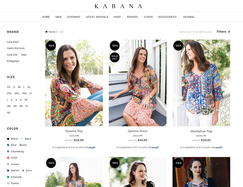
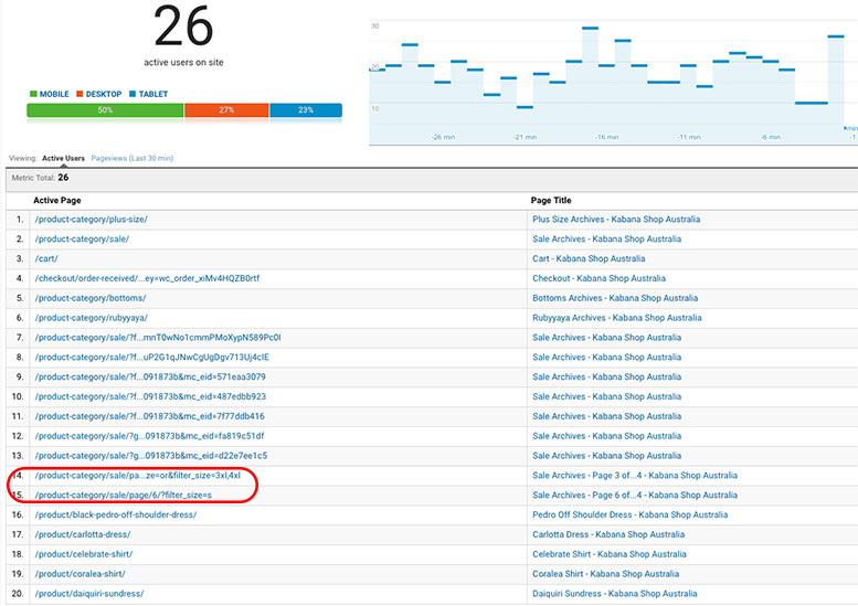
Pat’s note: I’d like to add a quick example here from Kabana Shop, a client I’ve been working with for a few years now. The filter you see in the sidebar in the image below is something we added recently but it’s an amazing feeling seeing (through Google Analytics, see next image) that people find it useful. They literally started using the filters as soon as we introduced it.


Fill up your pages with rich imagery
Fashion eCommerce marketing is largely about visuals, and your website should follow suit — anything you can provide to improve the appearance of your site will go a long way. Just as someone is unlikely to buy clothes from a poorly-dressed designer, you can’t reasonably expect a shopper to place their sartorial trust in a company with a hideous website.
For the pages in general, aim for a mix of custom shots, patterns of bold colours, high-quality stock images (particularly for panel backgrounds), and visual cues to enhance the navigation (arrows pointing towards product suggestions, for example). Think of how your favourite clothing stores feel uniquely welcoming, and try to replicate that aura.
You will need to make concessions for usability, though, so be mindful. White space, for instance, is a mandatory inclusion: it’s a great thing to produce some creative design work, but if the user can’t actually see where one product ends and the next begins, it’s going to cause some major problems. Don’t let the shoppers get overwhelmed.
Include great product photos and AR previews
Since the online shopper doesn’t get to actually try a fashion item before buying it, they can be a little uncertain about whether something that appears suitable will actually prove good enough. You can understand people being skeptical, particularly given how rampant misleading product descriptions are on some sites (particularly marketplaces — eBay is a frequent offender).
By including high-quality product photos (taken in good lighting using decent equipment and offered at high resolutions) as well as 360-degree previews allowing shoppers to fully review how product look. You can make a lot of progress towards convincing people to trust that they can order from you and actually receive what they expect to receive. This will also make your products look better — a bad photo of a great item will make it look cheap.
That’s not all, though, because you can do more through AR (augmented reality) previews. Virtual mirrors allow people to upload their photos and see previews of what they’d look like wearing particular items. It’s somewhat gimmicky and isn’t going to be truly representative, but it’s both enjoyable and fairly useful. To make the most of it, you’ll need to run your store on a platform with comprehensive AR tech support (the industry leader currently being Shopify as a result of its 2018 AR initiative), but I’d say it’s definitely worth looking into.
Go the extra mile with detailed measurements
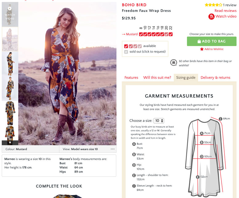
Clothing measurements can be highly frustrating in the sense that they’re commonly omitted entirely from product descriptions. Instead, shoppers are often expected to make do with simplistic sizing categories: small, medium, large, etc. This wouldn’t be so bad, except different manufacturers use different scales, and imports often use radically-different cut-off points.
If you’re small in Australia, you might be a medium in China, so ordering a Chinese import in small wouldn’t be a good idea. If you can provide detailed measurements, though, you can make life a lot easier for your customers — earning a lot of goodwill and likely picking up some valuable referrals in the process.
Pat’s note: Birdsnest‘s website is out of the ordinary; it offers the best shopping experience I have ever seen.

Implement comprehensive on-site search
In a physical store, you can go by aisles, but even then you’ll encounter difficulties that require you to ask in-store assistants for directions. The online equivalent of asking for directions is using a search function, and the more useful your search results are, the more interest and conversions they’ll spark.
Imagine that someone lands on your site hoping to find a certain type of skirt, but can’t see it in the menu items, so they search for it — and no results come up. As it happens, you do stock that type of item, but under a different name. This kind of confusion is very damaging and will lose you sales if you don’t address it. Ensure that your internal search is configured to parse natural language terms, and your customers will appreciate it.
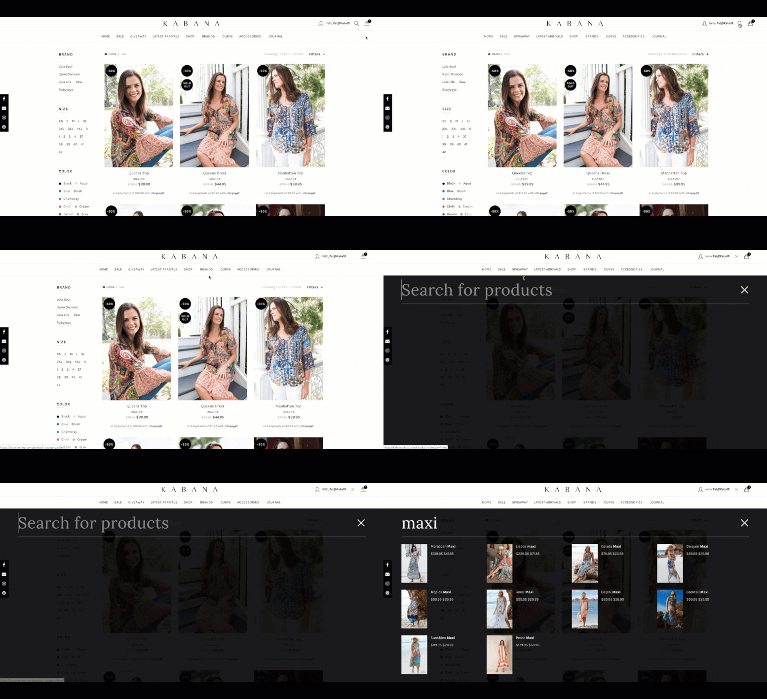
Though it may seem obvious, give your search feature a position of prominence at the top of the page, and style it to be impossible to miss. Additionally, finely polish the results and how they’re displayed: each result should have some kind of image with it to lend some context and having a set of live autocomplete suggestions as someone types will improve the experience.
Pat’s note: make the searching box work for you, not against you. This feature will only work if you are able to make it perform like a Ferrari. The following GIF shows how quick Kabana Shop is able to show results. And keep in mind that this hasn’t been accelerated, it’s the real speed!

Add outstanding support service to your fashion marketing mix
No matter how well you design your store, there will always be a need for a support service as part of your fashion ecommerce marketing strategy. You might think that your search bar is impossible to miss, for instance, but precedent suggests that there’s no feature that can’t be missed by someone. And when someone runs into trouble and looks for support, one of two things can happen:
They can field some canned replies, log a support ticket, get frustrated, and go elsewhere. After this, they’re unlikely to return. You may get back to them, but too late to make a difference — they’ve bought from another site and moved on.
They can reach out to you and get immediate support from a combination of a smart chatbot and a human helper ready to handle any escalations. Once you’ve helped them find what they need, they’ll be appreciative, and resolve to buy from you again.
If you can not only help people find specific things but also give them fashion tips (only on request, of course — making unwanted suggestions is a very bad idea), you’ll establish the kind of luxury feel usually associated with upmarket department stores, engendering customer loyalty and leading people to spend more with you.
The challenge of selling fashion items online is very different from its brick-and-mortar counterpart, but it isn’t inherently harder — furthermore, it applies to everyone in the same way, so it’s nothing to fear. It’s just a matter of translating that old spirit of service — exceeding customer expectations at every turn — into the digital realm. Follow these suggestions, and you should make a lot of progress.
